Sunday 24 March 2013

Seven Woman Artists Exhibition Review


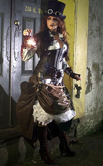
We visited the Seven Woman Artists exhibition in college, where seven local female artists displayed some of their artwork. The art varied from tiny, hand-embroidered pieces to a massive, printed wall hanging and decorative plates.


Lauren Steeper:
I really liked the cross-stitched work displayed by Lauren Steeper because it seems to be very unique and quirky. There were a number of embroidered pieces of fabric, side by side on the wall, in similar sizes and each with six words in a variety of fonts and coloured threads. The art itself didn’t strike me as particularly interesting, but I thought the way she chose the words to stitch onto the fabric was ingenious: she chose 49 random words from the dictionary, then waited for the lottery results and picked out the words which corresponded with the six numbers that had been drawn out.

However, I didn’t think much to the other piece of work she was displaying. It was literally just the back of old order receipt books that she had collected in her job as a waitress, most tatty and crumpled, including scribbles of orders, numbers and other notes. I didn’t really see any reason for it and, although it may have meant something to the artist, I couldn’t find anything to catch the interest of the viewer.


Holly Betton:
I liked the way Holly Betton’s work was displayed as it looked very decorative and reminded me of tradition English galas. The work itself was a mixture of sketchy images and witty phrases, printed onto mugs, cards and bunting, so I assume there would be more than one of each design. I think they are pleasant designs, but they remind me more of souvenirs than art.

Rebecca Hogg:
Rebecca Hogg’s artwork comprised of hand printed images onto ceramics and paper, displayed on the walls and in glass cabinets to protect them. All of the ceramic and paper backgrounds were white and the designs were in either black or blue with grey and gold detailing. One of her biggest inspirations is classic architecture, which works well on the plates and gives them an ornate feel. I think her work is beautiful and elaborate, reminiscent of Blue Willow plates.


Ashley Thomas:
Ashley Thomas was another artist whose work was household items, printed with sketchy, humorous designs of animals, food and tableware. There was a mixture of tea towels, cushions, aprons and some framed pieces, and I would assume there is more than one of each piece due to them being printed. I like the designs because they look quite traditional and vintage, but also have quirky elements (like glasses on some of the animals) which bring them up to date.


Yasmina Hamaidia:
I think Yasmina Hamaidia’s work was the most impressive out of all of the displays, mainly because of the sheer size of her wall hanging. It was a printed piece of fabric, comprising of a theatre stage background with images of tropical fruit, reptiles and old fashioned items layered on top. I loved the contrast of the brightly coloured features with a black and white background, making certain things (like the lizards and some of the fruit) more prominent than the rest. The main reason I like it though is because it makes you think about the meaning behind it and isn’t as easy to decipher as some of the other pieces of artwork in the exhibition.


Katy Aston:
I didn’t like Katy Aston’s work at all, using weaving, tiles and tessellated shapes to create curtains, a table and wall pieces. The art was made out of wood and textiles in bright colours and, although some of the colours worked well together, I thought most of these colours clashed and looked horrible against each other. It was very orderly and mathematical and I found it boring to look at, like very little of the artist’s imagination had been used to think up the work.


Roanna Wells:
I really loved Roanna Wells’ art: three framed pieces of hand stitching to create beautiful monochrome images. I think the tonal qualities that her stitching has created, where the images look almost as if they are dissolving, is fantastic and I would imagine it took a long time and a lot of effort to get them just right.


I enjoyed the Seven Woman Artists exhibition, with Rebecca Hogg, Yasmina Hamaidia and Roanna Well’s displays being my favourites. I found Lauren Steeper’s work the most interesting because of the way she generated the ideas for her artwork. However, I thought some of the displays were quite boring and reminded me more of gift ideas and souvenirs than pieces of art that should be displayed in an exhibition.

Wednesday 13 February 2013

Saturday 19 January 2013

Why Fashion?


Fashion can be amazing, but it can also have it's downsides. Sometimes we ask ourselves "why bother with fashion?"
Well here's why...

The most obvious reason would be for personal identity. Wearing the right clothes for your character and interests can be the best way of meeting new people who can actually relate to you. It works in the opposite way though, and people you wouldn't necessarily want to speak to will know to avoid you.
 
http://24.media.tumblr.com/tumblr_m8dj76T7i41qfdqf6o1_1280.jpg


 Merchandise is probably the most obvious way to show your identity: you can show what music you listen to, your favourite food and drinks, programs and films - there really is no end to what you can tell about yourself through fashion.


 Another useful part of socialisation fahion helps is attracting a partner. When you go on a date, you want to look stunning, and fashion can help that (whether it be a gorgeous dress or some magnificent heels). You have more confidence when you look your best and stand a much better chance if they are impressed by your image.


cloggo:

STEAMPUNK
What a shame that DizyDesi makes so few excursions into Steampunk because her outfit is fabulous
 Few More HERE


But fashion would be boring if we didn't all interpret it in our own little ways. If we all simply wore what we were told were trendy, nobody would stand out from the crown. There are so many different styles out there with so many cultures fitting into them. This is the main reason I am so interested in fashion.


But to me, fashion means all these things and more. Trends are very important to me, and I try my hardest to keep up with them, but not completely. I hate to look like other people, but I don't want to look totally out of style and I want my personality and interests to show through my clothing too. I think to make the most out of fashion, you've got to get the balance between your interests and between looking trendy just right.

Matt Bellamy Pop Art Piece


This was supposed to be in the style of Andy Warhol, so I tried quite a lot of different Muse related stuff behind the acetate, but nothing seemed to look as good as this. This is probably my favourite piece of work, even if it doesn't look quite as creative and pop arty as it should.

2012 Collage


  • Felix Baumgartner’s Space Jump broke three world records, including the sound barrier and furthest fall. His courage and achievements were incredible and many people watched live from around the world.
  • Skyfall was released on the 50th anniversary of James Bond, and the image shows every actor to play the part of James Bond throughout the years.
  • The Jimmy Saville investigation, revealing the scandal that the BBC and police had been covering up his crimes of paedophilia. This sparked many people to come forward about Jimmy Saville and also others, including MPs.
  • The Olympic Rings on London Bridge because they played a huge part in bringing the country together during the recession. Also brought in tourist trade and promoted businesses all over the country.
  • Michael Phelps competed for the last time at the London Olympics, now being the most decorated swimmer in history with 12 gold medals.
  • Neil Armstrong died, very important for being the first man on the moon.
  • Prince William and the Duchess Kate with a pregnancy test for the Royal Pregnancy. Her pregnancy is important as her baby will be the future heir to the throne.
  • The Diamond Jubilee brought a lot of tourists to England, boosting moral and the economy. Many people went to London to celebrate it.
  • Barack Obama was re-elected as president of America for another 4 years, beating Mitt Romney.
  • The Costa Concordia crashed on the Italian Island of Giglio, killing 32 people.
  • Rita Ora is a new artist who has become famous this year and many people look up to her.
  • Hurricane Sandy put New York and other places at a standstill, taking the lives of many and destroying homes and lifestyles.

Ballgowns: British Glamour Since The 1950s Review


Recently, I took a trip to London to visit the Victoria and Albert Museum with my college. We visited the ‘Ballgowns: British Glamour Since 1950’ exhibition, as well as the ‘Hollywood Costume’ exhibition. I found the Ballgowns exhibition really interesting with so many elegant gowns, past and present, by both established designers and more up and coming designers too.


My favourite dress was Gareth Pugh’s silvered leather dress because of its deceiving look. At first, I thought it was made from metal, but at closer glance you can tell it is made from soft leather. The tiny pieces of leather which make up the entire dress are very intricate and precise, making it a work of art. I don’t like how far the neck of the dress protrudes over the mannequins face, but I still think it’s a stunning dress.


Another favourite of mine which really caught my eye was Nicholas Oakwell’s gown. I love the star print, the amount of fabric in the skirt and how wearable this dress looks in comparison to some of the other, more extravagant gowns. The asymmetrical style of the dress would work perfectly if it wasn’t for the showing of the built-in undergarments, which looks really strange and, I think, makes it look a little tacky.


The latex gown by Atsuko Kudo was gorgeous with the black and gold colours working so well together with the lace pattern. I didn’t imagine latex would be a classy option for a ballgown, but on a slender figure, this dress looks so glamorous. This dress definitely took me by surprise.


It was fascinating to see a few of Alexander McQueen’s gowns in the exhibition as I find him an extraordinary designer, with this one being my favourite. I think the dipped hem of the skirt and wide hips are brilliant with the feathers, giving the look of an angel’s wings.


Downstairs, there were some interesting historical gowns and accessories, with this assortment by Christian Dior. The dress from his New Look collection was good to see as research for an article on Christian Dior and the New Look after the visit.


Another famous gown was Murray Arbeid’s, designed for and worn by the late Princess Diana. As simplistic as its design in, I think the contrast is beautiful, of both the red and black colours and the skin-tight and flared sections of the dress.


However, although most of the gowns were beautiful, elegant and extravagant, there were some dresses I thought were absolutely disgusting. As interesting as the digital printed lips on this dress were, and they may well have looked nice on a handbag, I thought this dress was hideous and I certainly didn’t expect to see anything this cheap-looking in a ‘glamour’ exhibition.


I didn’t even realise this apparent ballgown by Amanda Wakely was part of the exhibition when I first saw it – I thought it was simply a draped flag or piece of material. I definitely can’t see anybody wearing this to a classy event where a ballgown is in order.


But above all the other dresses, I think this Craig Lawrence number had to be the worst ballgown I have ever seen. It looked cobbled together and reminded me of foils from a hairdresser and there was no sense of femininity at all, something typically associated with glamorous ballgowns.


Overall, the entire exhibition was very interesting and informative, with a vast collection of ballgowns by so many different designers. The majority of dresses are truly stunning and elegant, spanning both historical and contemporary designs, and also including some iconic and famous gowns too. I found it a good experience to see these designer ballgowns properly, instead of just on pictures, and to catch a glimpse of true glamour.

Digital Technology


Tuesday 15 January 2013

Blog Reviews

One of my favourite blogs is the ModCloth Blog (http://blog.modcloth.com/) mainly because of it's ability to keep me up to date with all the latest fashions. They give great advice, and it's not all about fashion either. They have brilliant tips and videos on food and other interesting things that could come in useful.

I am a big fan of steampunk, although I don't actually own anything of the sort. SteamPunk Fashion (http://steampunkfashion.tumblr.com/) is a great little blog that is full of inspiration for steampunk outfit ideas and the sort of items you should wear for an authentic steampunk look.

Another rather unusual style I'm into is the vintage style (especially 1950s), and KittysVintageKitsch (http://kittysvintagekitsch.blogspot.co.uk/) is perfect for those of us who can't resist a bit of a vintage touch. This isn't technically a fashion blog, but more of a lifestyle blog of so many pretty and often delicate vintage items.

But, of course, as my blog suggests I am a massive fan of all things that scream "rockstar". Dangerous Fashion (http://dangerous-fashion.blogspot.co.uk/) has some stunning images of the sort of clothes and accessories I just can't resist, or would love to buy, if I thought I would look good in them. The images are so striking though, so even if you're not into rock 'n' roll, then it's still worth a look. You might just change your mind...

And last but not least, the fabric I wear far too much of, although I doubt that is possible. Leather Fashion Blog (http://leather-fashion.typepad.com/blog/) is fantastic for those of use who love the way that leather makes us feel: confident, sexy and feminine. They show us the latest celebrities to wear leather and the best leather goods we can buy, as well as advice on what may suit our body shapes etc. Perhaps a very useful blog at the moment with so much leather and similar fabrics on the high street at the moment.

Autumn Inspired Bra


I created a bra with a second year student, inspired by the Autumn. We used printed photos of autumn leaves, real leaves I collected and artificial berries to create an Autumn effect, although I think the larger, entrapped leaves ruined the effect of the berries sewn onto the straps as they covered them too much. I wouldn't apply them if I did it again.


 We took the bras outside for a photoshoot and promotional images. I really wanted to incorporate the Autumn theme by dangling the bra in trees and bushes.


 I editted the photo, trying to remove as many man-made objects from the picture. I wanted to enhance the colours of Autumn too, which actually led to the photo looking quite vintage.


When I saw this tree, I instantly thought of legs. I wanted this image to look as if it were some sort of forest body. I think the leaves all around on the ground just add to the effect.


However, I thought the bra didn't really stand out, and I was trying to promote my bra. This is definitely my favourite photo, with much more Autumn colours and the actual bra's colour has been boosted to enhance it and make it more noticeable against the leafy backdrop. I also blurred the image apart from the bra to make it stand out better also. Although this doesn't show any close- up detail on my bra, I think it shows the inspiration and image I was going for the best.

Monday 14 January 2013

Evolution Of My Dress Specification Board


We had to practise our skills on illustrator for a while before developing a final specification board.


I created my first specification board with four different colour ways.
 

Then I created my final dress specification board with 6 colour ways, inspired by the first dress I used. We had to uncorporate footprint repeats into 3 of the designs, so I tried to make mine look quite abstract and not too much like footprints.

Wednesday 9 January 2013

Repeat Prints


Repeat prints are basically a print on fabrics that consist of one pattern being repeated over and over. Some repeat prints are really obvious e.g. polka dots, because you can easily see that the pattern is being repeated. However, sometimes on more intricate designs, it's hard to see where the patterns join.Repeat patterns are very popular and used a lot on many clothes, wallpaper, carpets, curtains, cushions and many other items.

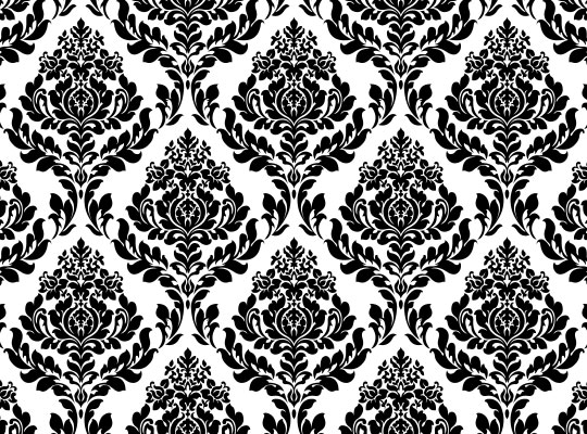
The left is an example of an obvious repeat print.

The right is an example of a not so obvious repeat print.


Footprint Research


Footprints are the impressions left behind on a surface by a person either walking or running. Usually, a footprint is seen as an indentation in a surface, although it could be something placed upon the surface that was on the bottom of the foot e.g. painting your feet and using them to print footprints onto paper. A series of footprints made by a person is called a trackway, although tracks are more often associated with tracking wild animals.

Footprints can be very useful, for example, in forensic science a footprint from a crime scene can help to identify a criminal. It could also show escape routes and perhaps lead them to where the criminal has fled to, making them easier to catch because they know the vicinity the criminal is in. They can also show more in detail facts about the criminals identity e.g. body mass, height or gender.